List Grid View Web Part
Using the List Grid View Web Part
The List Grid View web part displays information from a list of type 171, i.e., Project Tasks, grouped in sections, in a list grid display. It is intended for the simple management of tasks, supporting capabilities such as manual scheduling, drag and drop, and right-click task actions. The List Grid View web part is only available as a built-in component of the Task Tracker template; it is not available as a separate web part to add to pages.
Note: In order to save a new item, click within another cell in the grid; clicking outside the grid will not complete the save.
When entering an item in the bottom row you may need to use your keyboard down arrow to expose the name drop-down list in a Person or Group type column.
Toolbar Actions
The following actions are available in the toolbar at the top of the List Grid View web part: Refresh: Refreshes the data in the Grid. This does not refresh the Grid structure; F5 is needed to refresh the Grid structure.
-
 Add Section: If no grid row is selected,
the Add Section action will be displayed. To deselect a grid row, either click the Esc key on your keyboard, or mouse click into the currently
selected row to deselect it.
Add Section: If no grid row is selected,
the Add Section action will be displayed. To deselect a grid row, either click the Esc key on your keyboard, or mouse click into the currently
selected row to deselect it.
-
 Add Task: If a grid row is selected,
the Add Task action will be displayed. If a section was selected before clicking the Add Task action, a new subtask of the section will be added to the grid. If a task
was selected before clicking the Add Task action, a new sibling task will be added to the grid. Tasks that are dragged to a top level, or are fully outdented, will be converted into a section.
Add Task: If a grid row is selected,
the Add Task action will be displayed. If a section was selected before clicking the Add Task action, a new subtask of the section will be added to the grid. If a task
was selected before clicking the Add Task action, a new sibling task will be added to the grid. Tasks that are dragged to a top level, or are fully outdented, will be converted into a section.
 Indent: Moves the row one hierarchy level to the right. Indent is disabled when you are sorting on a column.
 Outdent: Moves the row one hierarchy level to the left. Outdent is disabled when you are sorting on a column.
 Expand All: Expands all rows in the grid.
 Collapse All: Collapses all rows in the grid.
Context Menu Actions
The following actions are available by right-clicking on sections and/or tasks:- Add Task: Available for sections and tasks. This option allows users to add a new task below the currently highlighted task, enhancing the ability to expand the task hierarchy.
- Add Subtask: Available for tasks. This option serves the same purpose as 'Add Task' but is specifically labeled to emphasize the creation of child tasks beneath the highlighted task, reinforcing hierarchical structuring.
- Open Details: Available for sections and tasks. Use the Open Details action to perform various functions on a selected item in a SharePoint dialog, including updating additional columns not displayed in the Grid, ensuring flexibility and control over all the task attributes.
- Indent: Available for tasks. Use this option to indent the selected task, visually indicating a hierarchical relationship by nesting it beneath its parent task.
- Outdent: Available for tasks. This option allows users to move a task out of its current hierarchy level, promoting flexibility in task organization.
Drag and Drop
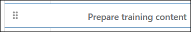
Drag and drop functionality is included in the grid. Simply hover the mouse over the drag icon in the left-most column, click and drag the item vertically, and drop it in the desired location.
With regard to the drop location, note the following:
- If prior to dropping the item, the vertical cell border line to the left of the item's Title cell is present, then you are dropping the item at the bottom of the row above it as a sibling item of that row.
- If no vertical line is present, then you are dropping the item at the top of the row below it as a sibling of that row.
- If there are top and bottom blue cell border lines running horizontally across the entire row you are dropping the item onto, then it will be dropped as a first child under that row.
Search
The Search functionality allows users to search the grid to quickly find needed data. This feature allows users to customize their search according to their specific needs or preferences, making the search functionality versatile and user-friendly.
Any relevant task contained under a summary task will be visually organized in a hierarchical manner, with their parent summary task positioned directly above them. This hierarchy structure serves to provide users with a clear and organized view of the tasks within the summary, enhancing the overall user experience and making it easier to manage and understand complex task lists.
Note: The search format for dates is: YYYY-MM-DD (a preceding '0' is needed if entering a single digit). Valid examples: 2030-09-27, 2030-09.
For Yes/No Boolean, use search terms 'True' and 'False'.
Keyboard Navigation
| Interaction Keys | Description |
|---|---|
| F2 | Edits the selected cell |
| Enter | Saves the current cell and refreshes the grid |
| Tab | Saves the current cell |
| Delete | Deletes the selected item |
| Esc | Deselects the currently selected cell |
| Ctrl + Shift + Up Arrow | Collapses selected item |
| Ctrl + Shift + Down Arrow | Expands selected item |
| Ctrl + Up Arrow | Collapses all items |
| Ctrl + Down Arrow | Expands all items |
| Ctrl + Home | Navigates to the first cell in the grid |
| Ctrl + End | Navigates to the last cell in the grid |
| Home | Moves focus to the first cell on the selected row |
| End | Moves focus to the last cell on the selected row |
| Up Arrow | Moves cell selection up |
| Down Arrow | Moves cell selection down |
| Right Arrow | Moves cell selection right |
| Left Arrow | Moves cell selection left |
| Alt + J | Sets the focus to the grid |
Configure the List Grid View Web Part
All web parts share basic modification functionality - click here to learn more. Modification options specific to the List Grid View web part are addressed below.
To configure the List Grid View web part: Click in an empty space on the grid, click the Grid tab in the Ribbon, and then click Configure List Grid Settings.
Note: In addition to the web part configuration described in this section, standard configuration actions can also be taken on the underlying Project Tasks list.
Web Part Settings
Title
Enter a title for the grid.
Chrome Type
Select a chrome type for the grid.
Select Source List
Select List
Select the source list, i.e., Project Tasks.
Filter
There are three filter options:
-
All items
This includes all items from the selected list. -
Items in this view
This uses the filtering from the selected view in the selected list. If there is no filtering specified in the selected view, then all items are included. -
Specify filter (CAML)
This allows you to write your own CAML filter and insert the code.
Column Settings
Columns
Optionally select the columns to display on the grid.
Note: The List Grid View web part only supports the following column types: Text (single line only), Choice (single choice only), Number, Currency, Date (Friendly format and Time are not supported), Yes/No, Person or Group (single selection only), and Calculated. Calculated default values are not supported.
All 'Required' columns (except for 'Person or Group' type columns) must have a default value set for them; users can later edit these default values after creating a new task entry in the List Grid View web part.
Percentage values will always be displayed without any decimal places.
You can view information and specify default behavior for columns in the grid as follows:
-
Display
Select the checkbox beside the column name to display the column on the grid. -
Column Name
This is the column name that is displayed to the user as configured in the settings of the associated list. -
Type
This is the column type as configured in the settings of the associated list. -
Position from Left
The position from the left side of the grid as presented to the user.
General Settings
Add a New Task
Optionally, show Add Task actions.
Delete Tasks
Optionally, enable deletion of Tasks in the grid.
Troubleshooting
Expand All Using the Keyboard Not Working
This will occur if the item to be expanded was selected with the keyboard arrow.