List Board View Web Part
Using the Board
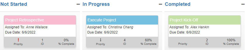
The boards web part displays information from a single list selected in the current site in a Kanban type display.
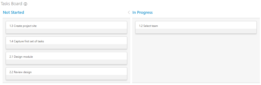
- To move a card from one column to another, select the card and drag it to the next column.
- To edit a card's item, double-click on the card and the item will open in edit mode.
- To collapse a column, and see the number of cards in the column, click on the column heading's chevron icon.
Note: For the best Boards experience we recommend using a modern browser. You may experience unexpected behaviors using Internet Explorer.
The Report Information Icon
When you click the report information icon  in the title, a popup shows the details of the current board. It also expands the Ribbon, opening the tab associated with the web part.
Details include: the report title, the type of report, the list used, the view selected, and the list column used to represent the board columns.
Tip! Double clicking the report information icon will open the Ribbon, dismissing the report information window.
Tip! If you need to refresh the data in a Board, you can do it by using the  Ribbon action.
Actions
Actions are available under the Board web part title. These actions are:-
 New Card: If set to be displayed, this action will open the New Item form when clicked. Saving
the new item will add a corresponding card to the Board and a new item to the source list that was chosen when the Board web part was configured.
New Card: If set to be displayed, this action will open the New Item form when clicked. Saving
the new item will add a corresponding card to the Board and a new item to the source list that was chosen when the Board web part was configured.
 Expand All: If swimlanes are set to be displayed, this action expands all swimlanes in the Board.
 Collapse All: If swimlanes are set to be displayed, this action collapses all swimlanes in the Board.
Configure the Board
All web parts share basic modification functionality - click here to learn about this. Modification options specific to the Board web part are addressed below.
Click here to learn how to add a web part to a BrightWork web part page.
To configure the Board web part:
- Click in the title of the Board web part (or the report information icon ) to expose the ribbon.
- Click the Board tab and then click Configure List Board Settings.
Web Part Settings
Title
Enter a title for the report.
Chrome
Select a chrome type for the report:
- Default
- Title and Border
- Title Only
Select Source List
Select List
Select the list or library you want to use.
Only lists or libraries with 'Choice' columns will be available to select.
Filter
There are three options:
-
All items in this list
This includes all items from the selected list or library. -
Items in this view
This uses the filtering from the selected view in the selected list or library. If there is no filtering specified in the selected view all items are included. -
Specify filter (CAML)
This allows you to write your own CAML filter and insert the code.
Default Sorting
When not using manual sorting, the sorting of cards in a column depends on the Filter selected.
- If 'All items in this list' is selected, then sorting is based on 'Title'.
- If 'Items in this view' is selected, then sorting is determined by the view selected. If the view selected is not sorted, then 'Title' is used.
- If 'Specify filter (CAML)' is selected, then sorting is based on 'Title'.
Manual Sorting
- Allow manual sorting: will enable drag and drop sorting of cards within a column or swimlane-column. This can be used to prioritise cards in the column. This is a common use case for a Kanban process.
There are some things to note about manual sorting:
- Sorting works within a column. It uses the cards around a dropped card to determine the sort order. So, manual sorting does not have much relevance outside of the Board.
- Manual sorting uses an internal hidden column called 'Order'. The 'Order' column is not available to use in views and is not displayed on forms.
- Task lists displaying tasks in a hierarchy are a special case. In a Task list that puts Tasks into a hierarchy, the 'Order' column is used to sort the Tasks within the hierarchy. So, we do NOT recommend using manual sorting in Boards for hierarchical Task lists.
- The manual sort order in a Board can be impacted by having manual sort ordering enabled in more than one Board. For this reason it is not recommended best practice.
- There is a troubleshooting section below should you experience any problems.
Column Settings
Column Settings
Select a list Choice column. Only single-value Choice columns are supported currently.

If you are using a choice column that allows 'Fill-in' choices, then only values in the default list will be available to the board.
Show Card Count
Select the checkbox to show the number of cards in each column/group of columns.
Board Column Settings
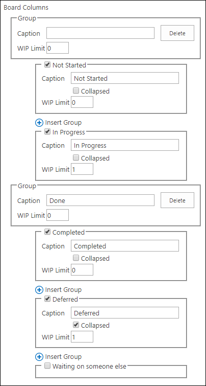
You can specify the default behaviour of each column on the board as follows:
-
Hide column checkbox
Select the checkbox beside the column name to hide the column on the Board. This will also hide the options for the column within the Board Settings page. For example, in the screenshot above the 'Waiting on someone else' column is hidden. -
Caption
Modify the column's display heading by editing the Caption text. Captions should be unique (as should the column values). -
Collapsed
Select Collaped so the column is collapsed by default when the Board is opened. This is useful for maximizing the space available on the Board. -
 Insert Group
Columns can be Grouped together under a higher level column. Select Insert Group and all Board Columns below the Group will be included within that Group. When inserting Groups:- Inserting the first Group into the middle of the list of Columns will automatically add a Group before the first Column value.
- Deleting the first Group will remove ALL Groups.
- Groups can show Card counts and can have WIP Limits set. Counts and WIP Limits on Groups total the cards in all Columns within the Group.
- WIP Limits for Groups are set independantly of the Columns. Therefore, they may not be equal to the sum of the WIP Limits of its Columns.
-
WIP Limit
WIP (Work In Progress) Limits have the following considerations:- WIP Limit is only avilable when the Show Card Count is selected.
- WIP Limit allows you to warn when the number of cards in a Column or a Group exceeds a limit set in the Board Settings.
-
Once you set a WIP Limit for a Column or Group, the Column will be highlighted when the number of Cards exceeds this WIP Limit.
For example, a Column with a WIP Limit of 3 will change colour if it contains 4 or more Cards. A warning icon also appears in the Column's heading. - A WIP Limit of 0 or blank means that no WIP Limit is set.
- WIP Limits are warnings, they are not enforced limits on the number of Cards in a Column.
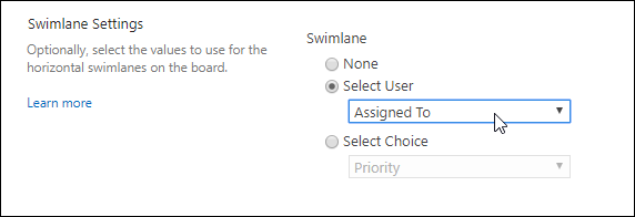
Swimlane Settings
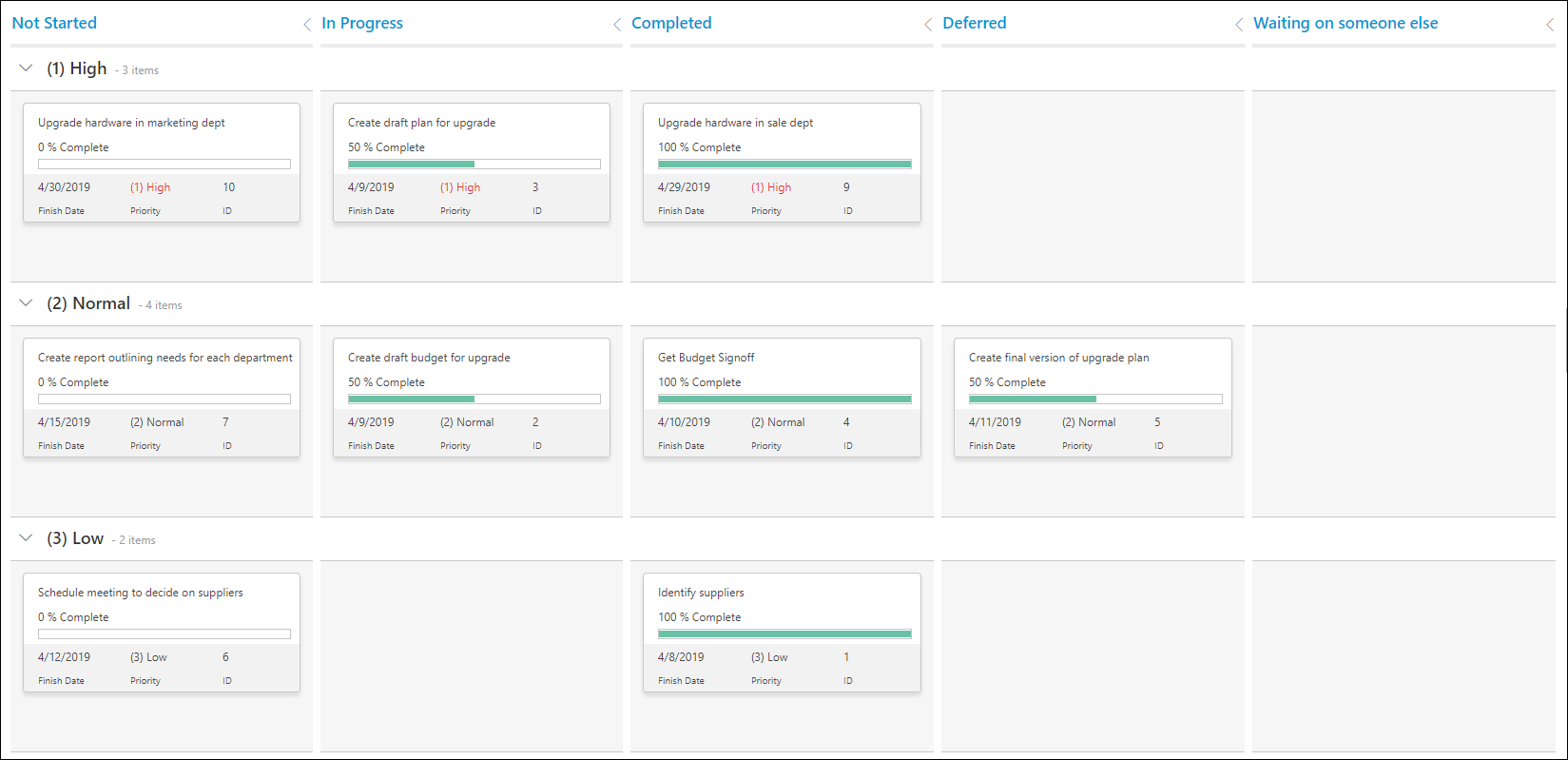
Swimlanes are used to categorize cards horizontally using either a User or a Choice column.
The options available when configuring swimlanes in a board are:
Prevent Drag and Drop
In some circumstances you may not want cards to be dragged between swimlanes. For example, you might want to have swimlanes for team members showing their tasks, but prevent the reassignment of tasks between team members.
Note: This restriction only refers to dragging and dropping cards between swimlanes and does not apply to dragging and dropping cards between columns.
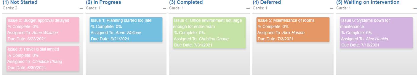
Show Card Count
Select the checkbox to show the number of cards in each swimlane.
In this example there are 3 cards in this swimlane.
Swimlane Settings
Configure the swimlane values using one of these options:
-
None
Select to show no swimlanes. This is the default. -
Select User
Select a Person or Group type of column, for example 'Assigned To', as the swimlanes.
-
Only single-value columns are available for selection.
For example, if a task can be assigned to multiple people then the 'Assigned To' column will not be an option when configuring the swimlane. -
Only those names found in the cards displayed are used in the swimlanes.
If you want to assign a card to someone not included in the swimlanes then you need to double click the card to edit it and enter the name. Saving the item will refresh the board and the newly assigned person's name will be a swimlane. - Names will be sorted in alphabetical order.
- If a card does not have a user assigned, then it will appear in an "Unassigned" swimlane at the bottom of the board.
-
Only single-value columns are available for selection.
-
Select Choice
Select a Choice type of column, for example 'Priority', as the swimlanes.
- Values will be sorted in alphabetical order.
-
Only single-value columns are available for selection.
For example, if a task can be assigned to multiple categories then the Category column will not be an option when configuring the swimlane. - If a card does not have a value from the Choice column selected, then it will appear in an "Unassigned" swimlane at the bottom of the board.
Card Settings
Configure the card's content by selecting one, some, or all of the following on the card:
Required
-
Title
You must select a card title. This is typically the item's title but can be any 'Single line of text' item.
Optional
-
User
Select any 'People or Group' column to display, or leave this option blank.
-
% Complete
Select to show the percent complete value and a progress bar.
-
Date
Select any 'Date or Time' column to display, or leave this option blank.
Highlight late dates will display the date in red when:
- Tasks: the task is not 'Completed' and the date value shown is less than today. The specific tasks list in this case is of type 107.
- BrightWork Lists: for BrightWork specific lists like; Project Issues, Project Change Requests, Projects Risks, Projects Tracker, etc. if the Completed Flag is 'No' and the date value shown is less than today.
- Other list types: the date value shown is less than today.
-
Priority
Highly priority items display in red if the Priority value contains a '1'.
-
Reference
Select a Reference or Id column to display, or leave this option blank.
-
Additional Columns
Additional list columns can be configured to display on the cards. You can choose the column position in relation to the other list columns that are configured to display on the cards. Please note columns of type Multiple Lines of Text are not supported.
If you select any of: Date, Priority, or Reference, then the bottom row of the card will appear. If options are not selected, then the space on the card will be allocated but the space will be empty.
General Settings
Select a theme
Boards come with a number of different themes that allow you to change the look of your board. To preview themes, select a theme from the Theme drop-down menu and a preview image will be displayed.
Note: Selecting different themes for different Board web parts on the same page is not supported. Only one theme will be used throughout in this scenario.
Board themes can also be impacted by having a Gantt Chart web part on the same page. Equally, a Board theme can impact the theme for a Gantt Chart. For this reason, Boards and Gantt Charts are not supported on the same page.
Search
Search allows you to search all cards within the board using a text string. This is optional and by ticking the box, a search bar will appear above the board.
Refresh Board
The 'Refresh Board' option refreshes the board every time a card is moved to a new column. This may be useful if data displayed on the card changes as the result of the move. For example, a task's % Complete changes if moved from 'Not Started' to 'In Progress' and refreshing the board will show the change.
Add a New Card
Option to show the 'Add a new card' icon on the top left of the Board.
Edit/View mode
Choose whether the item opens with the Edit form or the View form.
Advanced Card Styling
Advanced Card Styling is designed for IT Professionals and Developers with knowledge of JavaScript and HTML.
The simplest way to change the Board styling remains selecting a theme
in the General Settings section.
- Styling code, if not done correctly, can break your Board!
- BrightWork cannot help debug any JsRender code you write.
- BrightWork endeavors to provide lots of examples for you to reuse. So, if you have an example you would like to see shared here please contact our support and services team.
Overview
Advanced card styling allows you to format cards using a formatting known as JsRender. You do NOT have to specify anything in this section. If you leave this blank the default styling is used.
Once advanced card styling is being used everything on the card has to be explicitly specified. The theme selected will still apply to the rest of the Board. This styling is specific to the cards, so it is a good idea to select your preferred theme first.
Identifying Columns to Display
Note that only the columns selected on the Board Configure Settings page are currently possible to display. Note also that if the JsRender references a card column that is not set to display, you will get an error.
The following are the out of the box columns. Please note that these are case sensitive.
- Title column selected:
:BW.cardTitle - User column selected:
:BW.cardUsername -
% Complete:
:BW.cardPercentComplete
There is also a class to display the % Complete bar:
- The default table class is:
percentCompleteIndicatorBoard - The default table cell class is:
percentCompleteIndicatorBoard1 - The default table cell styling for the percentage that is done is:
>percentComplete.style - The default table cell styling for the percentage that is remaining is:
>percentComplete.remainderStyle
- The default table class is:
-
Date column selected:
:BW.cardDate
There is also a class to display the default highlighting:>date.class -
Priority:
:BW.cardPriority
There is also a class to display the default highlighting:>priority.class - Reference column selected:
:BW.cardReference -
Along with the card columns, you can also reference the Board Column value and the Swimlane value for an item.
These are internal use value and so must be parsed to remove a prefix of 'WPQ3_'. These can be handy for conditional formatting rules.
- Column value:
>columnKeyFor example, a Status column could have a value of WPQ3_(1) Not Started - Swimlane value:
>swimlaneKey
>sharepointOrder - Column value:
Additional Columns
All additional columns selected will be referenced as :BW and the SharePoint internal column name of the list column. For example, :BW.PriorityIcon
Useful Constructs
-
To show a column's value in a card use:
{{:BW.cardTitle}}
-
Using if .. then .. else conditions:
The syntax forifconditions uses JavaScript, and has the following options:- Equals:
{{if yourColumnName === value}} - Greater than:
{{if yourColumnName > value}} - Less than:
{{if yourColumnName < value}} - Not Equals:
{{if yourColumnName !== value}} - Greater then or Equal:
{{if yourColumnName >= value}} - Less than or Equal:
{{if yourColumnName <= value}}
- Equals:
Examples
(1) IF - THEN - ELSE
The following checks % Complete values and formats the background of the card accordingly.
{{!-- For a Project Issue List --}}
{{!-- It requires % Complete to be displayed on the card --}}
{{!-- If % Complete is 0% --}}
{{if BW.cardPercentComplete === 0}}
<div style="color:white; background-color:#F8BBD0">
{{else}}
{{!-- If % Complete is less than 100% --}}
{{if BW.cardPercentComplete < 100}}
<div style="color:white; background-color:#75C0E0">
{{else}}
{{!-- Otherwise % Complete is 100% --}}
<div style="color:white; background-color:#C5E1A5">
{{/if}}
{{/if}}
{{:BW.cardTitle}} <br/>
{{!-- Check if % Complete and the Date exist before displaying them --}}
{{if BW.cardPercentComplete !== null}}
% Complete: {{:BW.cardPercentComplete}}% <br/>
{{/if}}
Assigned To: <em>{{:BW.cardUsername}}</em> <br/>
{{if date !== null}}
Due Date: {{:BW.cardDate}} <br/>
{{/if}}
</div>
(2) IF - THEN - ELSE using a Status columnKey
The following checks Status values for an Issues list and formats the background of the card accordingly.
It also contains error checks that check that the % Complete and Date values exist.
These can cause errors in the card display if they are used in the JsRender Code but are not passed to the Board.
{{!-- For a Project Issue List --}}
{{!-- Format based on Status if the Board Column is Status --}}
{{!-- Note, if applied to a Project Tasks list the Status values are different --}}
{{!-- If Status is (1) Not Started --}}
{{if columnKey.substr(6,1) === '1'}}
<div style="color:white; background-color:#F8BBD0">
{{else}}
{{!-- If Status is (2) In Progress --}}
{{if columnKey.substr(6,1) === '2'}}
<div style="color:white; background-color:#75C0E0">
{{else}}
{{!-- If Status is (3) Complete --}}
{{if columnKey.substr(6,1) === '3'}}
<div style="color:white; background-color:#C5E1A5">
{{else}}
{{!-- If Status is (4) Deferred --}}
{{if columnKey.substr(6,1) === '4'}}
<div style="color:white; background-color:#E59866">
{{else}}
{{!-- Status is (5) Waiting on someone else --}}
<div style="color:white; background-color:#D2B4DE">
{{/if}}
{{/if}}
{{/if}}
{{/if}}
{{:BW.cardTitle}} <br/>
{{!-- Check if % Complete and the Date exist before displaying them --}}
{{if BW.cardPercentComplete !== null}}
% Complete: {{:BW.cardPercentComplete}}% <br/>
{{/if}}
Assigned To: <em>{{:BW.cardUsername}}</em> <br/>
{{if date !== null}}
Due Date: {{:BW.cardDate}} <br/>
{{/if}}
</div>
(3) SHOWING AN IMAGE
The following code checks the number in the Priority value, and displays an icon.
It also does some other formatting as further examples.
{{!-- For a Project Issue List --}}
{{!-- Requires that all columns are displayed on the card --}}
{{!-- If % Complete is 0% --}}
{{if BW.cardPercentComplete === 0}}
<div style="color:white; background-color:#F8BBD0; font-size:14px; padding: 5px 0px 5px 0px">
{{else}}
{{!-- If % Complete is less than 100% --}}
{{if BW.cardPercentComplete < 100}}
<div style="color:white; background-color:#75C0E0; font-size:14px; padding: 5px 0px 5px 0px">
{{else}}
{{!-- Otherwise % Complete is 100% --}}
<div style="color:white; background-color:#C5E1A5; font-size:14px; padding: 5px 0px 5px 0px">
{{/if}}
{{/if}}
{{:BW.cardTitle}} <br/>
</div>
<div style="font-size:12px">
Assigned To: <em>{{:BW.cardUsername}}</em> <br/>
Due Date: {{:BW.cardDate}} <br/>
</div>
{{!-- Check the Priority Code and show an icon instead of the text --}}
<div class='e-cardcontent'>
<table class='e-cardtable'>
<tbody style="background-color:lightgrey">
<tr>
<td
class='e-contentcell'
style='text-align:center'>
{{if BW.cardPriority.substr(1,1) === '1'}}
<img src="/_layouts/15/images/bw_lt723_priority-1.gif">
{{/if}}
{{if BW.cardPriority.substr(1,1) === '3'}}
<img src="/_layouts/15/images/bw_lt723_priority-3.gif">
{{/if}}
<br />
<div style='font-size:10px;'>Priority</div>
</td>
<td
class='e-contentcell'
style='text-align:center'>
{{:BW.cardReference}}
<br />
<div style='font-size:10px;'>ID</div>
</td>
<td
class='e-contentcell'
style='text-align:center'>
{{:BW.cardPercentComplete}}%
<br />
<div style='font-size:10px;'>% Complete</div>
</td>
</tr>
</tbody>
</table>
</div>
(4) DEFAULT CARD STYLING
This assumes that all coumns are displayed on the card.
{{!-- For a Project Issue List --}}
{{!-- Requires that all columns are displayed on the card --}}

<div class='e-cardcontent'>
    <table class='e-cardtable'>
        <tbody>
            <tr>
                <td colspan='3'
                    class='e-contentcell'
                    style='padding-right:5px'>
                    {{:BW.cardTitle}}
                </td>
            </tr>
            <tr>
                <td colspan='3'
                    class='e-contentcell'>
                    Assigned To: {{:BW.cardUsername}}
                </td>
            </tr>
            <tr>
                <td colspan='3'
                    class='e-contentcell'>{{:BW.cardPercentComplete}} % Complete</td>
            </tr>
            <tr>
                <td colspan='3'
                    class='e-contentcell'
                    style='padding-top:0px; padding-right:10px'>
                    <table border='0'
                        cellspacing='0'
                        cellpadding='0'
                        class='percentCompleteIndicatorBoard'>
                        <tbody>
                            <tr>
                                <td class='percentCompleteIndicatorBoard1'
                                    style='{{>percentComplete.style}} ;'></td>
                                <td style='{{>percentComplete.remainderStyle}} ;'></td>
                            </tr>
                        </tbody>
                    </table>
                </td>
            </tr>
            <tr class='bw-shadedBackground'>
                <td class='e-contentcell'>
                    <div style='overflow:hidden'
                    class='{{>date.class}} '>{{:BW.cardDate}}</div>
                </td>
                <td class='e-contentcell'>
                    <div style='overflow:hidden'
                    class='{{>priority.class}} '>{{:BW.cardPriority}}</div>
                </td>
                <td class='e-contentcell'>
                    <div style='overflow:hidden'
                    class='bw-shadedBackground'>{{:BW.cardReference}}</div>
                </td>
            </tr>
            <tr class='bw-shadedBackground'>
                <td class='e-contentcell'
                    style='font-size:10px;'>
                    <div class='bw-shadedBackground'
                    style='overflow:hidden'>Finish Date</div>
                </td>
                <td class='e-contentcell'
                    style='font-size:10px;'>
                    <div class='bw-shadedBackground'
                    style='overflow:hidden'>Priority</div>
                </td>
                <td class='e-contentcell'
                    style='font-size:10px;'>
                    <div class='bw-shadedBackground'
                style='overflow:hidden'>ID</div>
                </td>
            </tr>
        </tbody>
    </table>
</div>
Deeper Dive into Boards
Tip! Custom versions of web parts can be reused across a site collection by adding them to the web part gallery.
Board Web Part Settings
Board web parts support three types of Chrome Type. As a result, changes made using the SharePoint Edit Web Part tool pane to the Chrome Type may not act as expected.
Chrome Type:
- Chrome Type should only be set to one of the following; Default, Title and Border, or Title Only. (See Web Part Settings above).
- Selecting either 'None' or 'Border Only' will cause the web part to display using the 'Default' setting.
- It is worth noting that 'Title Only' still appears with a border, albeit a thinner one. This is because the board itself shows a border, as distinct from the web part that displays it.
Height:
- Height values set in the web part's tool pane, in the Appearance section, are not saved. The Board automatically adjusts it's height based on the size of the screen in order to facilitate column sticky headers.
Security Consideration
- SharePoint Permissions are supported; no access means no cards are displayed.
- Moving a card updates the card's data, so edit access is required to drag and drop cards.
- Double clicking a card to open it will open it in edit mode if you have the permissions to edit the item.
- Double clicking a card to open it will open it in read mode if you only have the permissions to read the item.
Troubleshooting Boards
Troubleshooting Values
- Card counts do not work in columns with choice field values containing " (Double Quote), ' (Single Quote), or & (Ampersand).
- Collapsed columns do not show their name if no data exists in the board.
- In the unlikely event of there being no 'Title' column in the list selected, then the first 'Single line of text' column is used instead.
- Only lists with a choice column are available to select in a board. However some lists are always excluded namely: Scheduled Report Emails a well as all the BrightWork caches.
Troubleshooting Swimlanes
-
Issue 1:
Columns do not align with their associated column header when the screen display area changes, e.g. when using Focus on Content , or when the page size is changed.
-
Resolution 1:
Refresh the page or expand and collapse the swimlane or column. -
Issue 2:
The bottom swimlane does not collapse or expand after clicking the toggle button and sticks in its most recent state. -
Resolution 2:
Refresh the page and you should then be able to collapse/expand the swimlane.
Troubleshooting Board Manual Sorting
-
Issue 1:
When dragging and dropping a card into a different column, upon completion of the action an empty blue target box remains on screen, and the dropped card does not remain in the intended location. -
Resolution 1:
Refresh the browser screen and redo the drag and drop action. -
Issue 2:
The following warning message appears:
Error: This card cannot be dropped in this location because the number used to track the sort order is not precise enough. TIP: try moving the cards in a different sequence. -
Possible Reasons:
- The internal 'Order' column, used to track the manual sort order, has too many digits for SharePoint to update. In effect, the numeric gap between two cards has exceeded the limit that can be handled by SharePoint. This can happen if the same two cards are repeatedly dragged and dropped over each other, or if a large number of cards are dropped between two cards over time.
- If you are dropping a card between two cards with the same internal 'Order' column. This is an unusual scenario, but can happen with tasks from a hierarchical Tasks list.
-
Resolution 2-1:
The simplest solution is to drag and drop the impacted cards to another location and then back to their correct location. This has the effect of resetting the numeric gap between them, allowing for further dragging and dropping. -
Resolution 2-2:
If you are a SharePoint administrator, you can also unhide the 'Order' number in the list and reset the values manually. Below is a PowerShell script you can modify to do this. The steps are:- On the SharePoint Server, copy the PowerShell script below into PowerShell ISE
- Modify the $siteURL and $listName variables for the list you are updating
- Run the script
- In SharePoint, the Order column should now be visible and can be added to a view from where it can be manually updated
Add-PSSnapin Microsoft.SharePoint.PowerShell

# Define what it to change
$siteURL = "https://server/sites/sitecollection/area/project";  # 1. Add the Site URL
$listName = "Project Tasks";                                    # 2. Add the name of the List

# Change List Schema to unhide order field.
$web = Get-SPWeb -Identity $siteURL;
$list = $web.Lists[$listName];
$field = $list.Fields.GetFieldByInternalName("Order");
$field.SchemaXml = $field.SchemaXml.Replace('Hidden="TRUE"','Hidden="FALSE"');
Write-Host '__________________________________________________'
Write-Host 'Order field is set to visible in list :  ' $list.Title -foregroundcolor Green -nonewline
Write-Host ' @ ' $siteURL -foregroundcolor Green
Write-Host '__________________________________________________'
$web.Dispose();