Metric Scorecard
- How to Configure the Metric Scorecard
- Metric Scorecard Configuration Settings
The Metric Scorecard web part enables you to display the history of multiple metric items from a specified Metric list. This web part has been added to the Status Charts tab on the Project Lite, Project Standard, Project Structured and Project Office templates.
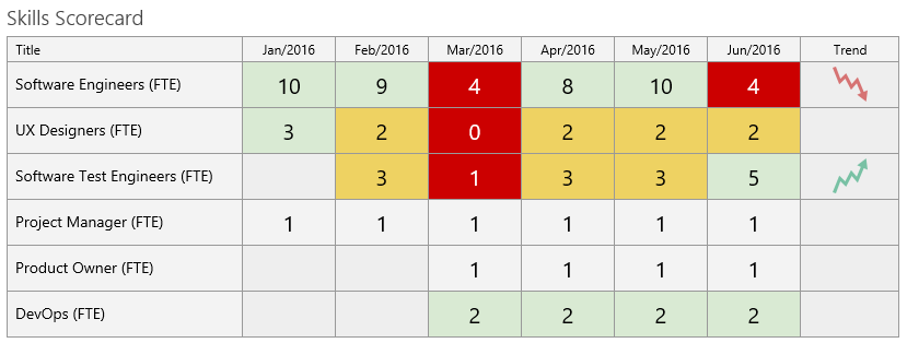
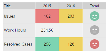
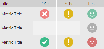
The metric history can be displayed either as a color block that maps to the metric indicator status (Target, Warning, or Danger, with the option of including the metric value) or you can display the appropriate metric indicator status icon.
The metric histories are displayed in selected Intervals (Days, Weeks, Months, Quarters, or Years) and using the selected Interval Value Formula (Minimum, Maximum, First, or Last).
The display can include a Trend icon that will notify you of any change between the last two intervals (good or bad) in each metric item.
Note: The calculation for Trend icons uses the previous two interval metric Indicator values. It uses the Target (green), Warning (yellow), or Danger (red) indicator to calculate the icon. It does not use actual metric values.
So, for example, if the current metric Indicator is Target (green) when it was Warning (yellow), then the trend icon will be positive. If the current metric Indicator is Danger (red) when it was Target (green), then the trend icon will be negative.
Click here to learn how to add a web part to a BrightWork web part page.
All web parts share basic modification functionality - click here to learn about this. Modification options specific to the Metric Scorecard web part are addressed below.
You can use the Apply Metric Value option in the Manual Number or Manual Date metrics to add metric values in the past. The scorecard will automatically adjust to these new values. An example use for this feature is if you need to enter total sales for October but it is now November. You can use the Apply Metric Value option to apply the metric to a date in October.
How to Configure the Metric Scorecard
To configure a Scorecard:
- Click in the title of the scorecard to expose the ribbon.
- Click the Metric Scorecard tab and then click Configure Metric Scorecard Settings.
Web Part Settings
Title
Enter a title for the web part.
Chrome Type
Select a chrome type for the web part:
- Default
- Border Only
- None
- Title and Border
- Title Only
Project Metric Items
Select the metric items to include in the scorecard.
The Available Metrics and Added Metrics windows display Metric IDs. To see the related Metric Title, click on a Metric ID and it will display under the Available Metrics window.
Interval Definition Settings
The Interval Definition Settings section defines the data that the Scorecard will display.
- Interval
Select the time units that will be used in the scorecard. The options include: Days, Weeks, Months, Quarters, and Years. - Show
Select the Interval Window that will be used in the scorecard. The options include:- All Data
- Last number of Intervals
- Time Window. You can specify a specific period of time to chart between. Leaving the Finish Date blank will set the Finish Date to today's date.
- Select the Interval Value Formula
The options include:- Minimum (the lowest value or earliest date the metric achieved during the interval)
- Maximum (the highest value or most recent date the metric achieved)
- First (the first value or date the metric achieved during the interval period)
- Last (the last value or date the metric achieved during the interval period)
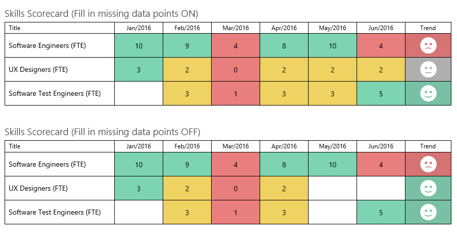
- Missing Intervals
Select to fill in missing data points with the last interval state.To understand this setting, examine the two images below. Both of these Scorecards are working off the same data and are configured exactly the same, except for the 'Fill in missing data points' setting.
When 'Fill in missing data points' is enabled, it creates a data point for every interval, even if the data has not changed. When 'Fill in missing data points' is not enabled, gaps will appear where there is no data.
Scorecard Appearance
The Scorecard Appearance section defines the how the scorecard looks and feels. You can select from a pre-defined theme, or adjust individual elements to appear how you want. A preview window on the page will update as you make changes.
Select a Theme
Select a theme from the drop-down to change the whole scorecard look. Each theme has two presets where you can choose between icon representations or block colors backing the metric values.
You can also choose to customize the theme yourself by selecting "Custom Theme". Your changes will be reflected in the theme preview as you change them.
Custom Theme Settings
These settings control how the containing grid, header, metric title and interval columns, and metric trend icons appear.
Grid Settings
- Border Width: Set the width of the grid border in pixels (0 - 5).
- Border Color: Pick the color for the grid border.
- Show borders between intervals: Toggle the showing of interval seperating borders.
- Row Height: Set the height of the row in pixels (10 - 100).
- Set Column Width: Check the checkbox to adjust the width of the Metric title and Intervals in pixels (20 - 600). Unchecking the box will return the values to their default state.
Header Row
- Background: Pick the color for the header background.
- Font Color: Pick the color for the header font.
- Font Size: Set the height of the header font in pixels (10 - 20).
- Font Style: Set the style of the header text to Regular or Bold.
Metric Title
- Background: Pick the color for the metric title background.
- Font Color: Pick the color for the metric title font.
- Font Size: Set the height of the metric title font in pixels (10 - 20).
- Font Style: Set the style of the metric title text to Regular or Bold.
- Link metric title to metric: Turns the metric title into a link that opens the metric details in a dialog.
Intervals
Toggle between showing intervals as a block color, or as an icon.
Tip! Click the X in the color picker to set the color to transparent.
Missing Values
- Background: Pick the color for missing values.
Target
- Background: Pick the color for Target items.
- Font Color: Pick the color for the item value text. Note: When showing as block colors only.
- Target Icon: Enter the relative URL for the icon. Note: When showing as icons only.
Warning
- Background: Pick the color for Warning items.
- Font Color: Pick the color for the item value text. Note: When showing as block colors only.
- Warning Icon: Enter the relative URL for the icon. Note: When showing as icons only.
Danger
- Background: Pick the color for Danger items.
- Font Color: Pick the color for the item value text. Note: When showing as block colors only.
- Danger Icon: Enter the relative URL for the icon. Note: When showing as icons only.
No Indicator
- Background: Pick the color for items with no indicator.
Show Metric Interval Value
Toggle whether to show the metric value. Note: When showing as block colors only.
- Font Size: Set the height of the metric value font in pixels (10 - 20).
- Font Style: Set the style of the metric value to Regular or Bold.
Trend
Toggle showing an icon for the trend.
Improving Icon
- Icon: Enter the relative URL for the icon.
- Background: Pick the color for the icon background.
Neutral Icon
- Icon: Enter the relative URL for the icon.
- Background: Pick the color for the icon background.
Declining Icon
- Icon: Enter the relative URL for the icon.
- Background: Pick the color for the icon background.
Trend icons (32 pixels):
| Image | URL | |
|---|---|---|
 | /_layouts/15/images/bw_sc_TrendArrow01_32.png | |
 | /_layouts/15/images/bw_sc_TrendArrow02_32.png | |
 | /_layouts/15/images/bw_sc_TrendArrow03_32.png | |
 | /_layouts/15/images/bw_sc_TrendArrow04_32.png | |
 | /_layouts/15/images/bw_sc_TrendArrow05_32.png | |
 | /_layouts/15/images/bw_sc_TrendArrow06_32.png | |
 | /_layouts/15/images/bw_sc_TrendArrow07_32.png | |
 | /_layouts/15/images/bw_sc_TrendArrow08_32.png | |
 | /_layouts/15/images/bw_sc_TrendArrow09_32.png | |
 | /_layouts/15/images/bw_sc_TrendArrow10_32.png | |
 | /_layouts/15/images/bw_sc_TrendArrow11_32.png | |
 | /_layouts/15/images/bw_sc_TrendArrow12_32.png | |
 | /_layouts/15/images/bw_sc_TrendArrow13_32.png | |
 | /_layouts/15/images/bw_sc_TrendArrow14_32.png | |
 | /_layouts/15/images/bw_sc_TrendArrow15_32.png | |
 | /_layouts/15/images/bw_sc_TrendArrow16_32.png | |
 | /_layouts/15/images/bw_sc_TrendArrow17_32.png | |
 | /_layouts/15/images/bw_sc_TrendArrow18_32.png | |
 | /_layouts/15/images/bw_sc_TrendArrow19_32.png | |
 | /_layouts/15/images/bw_sc_TrendArrow20_32.png | |
 | /_layouts/15/images/bw_sc_TrendArrow21_32.png | |
 | /_layouts/15/images/bw_sc_TrendArrow22_32.png | |
 | /_layouts/15/images/bw_sc_TrendArrow23_32.png | |
 | /_layouts/15/images/bw_sc_TrendArrow24_32.png | |
 | /_layouts/15/images/bw_sc_TrendArrow25_32.png | |
 | /_layouts/15/images/bw_sc_TrendArrow26_32.png | |
 | /_layouts/15/images/bw_sc_TrendArrow27_32.png | |
 | /_layouts/15/images/bw_sc_TrendArrow28_32.png | |
 | /_layouts/15/images/bw_sc_TrendArrow29_32.png | |
 | /_layouts/15/images/bw_sc_TrendArrow30_32.png | |
 | /_layouts/15/images/bw_sc_TrendArrow31_32.png | |
 | /_layouts/15/images/bw_sc_TrendArrow32_32.png | |
 | /_layouts/15/images/bw_sc_TrendArrow33_32.png | |
 | /_layouts/15/images/bw_sc_TrendArrow34_32.png | |
 | /_layouts/15/images/bw_sc_TrendArrow35_32.png | |
 | /_layouts/15/images/bw_sc_TrendArrow36_32.png | |
 | /_layouts/15/images/bw_sc_BlockHappy32.png | |
 | /_layouts/15/images/bw_sc_BlockIndifferent32.png | |
 | /_layouts/15/images/bw_sc_BlockSad32.png | |
 | /_layouts/15/images/bw_sc_MondrianHappy32.png | |
 | /_layouts/15/images/bw_sc_MondrianIndifferent32.png | |
 | /_layouts/15/images/bw_sc_MondrianSad32.png | |
 | /_layouts/15/images/bw_sc_RegularHappy32.png | |
 | /_layouts/15/images/bw_sc_RegularIndifferent32.png | |
 | /_layouts/15/images/bw_sc_RegularSad32.png | |
 | /_layouts/15/images/bw_sc_RegularTarget32.gif | |
 | /_layouts/15/images/bw_sc_RegularWarning32.gif | |
 | /_layouts/15/images/bw_sc_RegularDanger32.gif |
Tip! Replace 32 with 16 or 64 in the image URLs to change the image size to 16 or 64 pixels respectively.