Configure a Web Part
Some web parts have specific modification options and these are addressed in the web part specific topics. However modifying most web parts involves some or all of the settings below.
Modify a Web Part
To modify a web part:
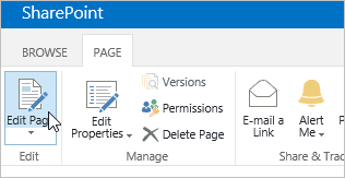
- Click Page | Edit Page to open the page in edit mode.
- Click 6 on the web part toolbar and select Edit Web Part to open the tool pane for the web part in question.
- Make your modifications and click OK.
Common Web Parts Properties
All Web Parts share a common set of properties that control their appearance, layout, advanced, Ajax options, and miscellaneous characteristics.
The common Web Part properties that you see in the tool pane may be different from what is documented in this section for several reasons:
- To see the Advanced section in the tool pane, you must have appropriate permission.
- For a specific Web Part, a Web Part developer may have chosen not to display one or more of these common properties or may have chosen to create and display additional properties that are not listed below in the Appearance, Layout, and Advanced sections of the tool pane.
Appearance
|
Property |
Description |
|
Title |
Specifies the title of the Web Part that appears in the Web Part title bar. |
|
Height |
Specifies the height of the Web Part. |
|
Width |
Specifies the width of the Web Part. |
|
Chrome State |
Specifies whether the entire Web Part appears on the page when a user opens the Web Part Page. By default, the chrome state is set to Normal and the entire Web Part appears. Only the title bar appears when the state is set to Minimized. |
|
Chrome Type |
Specifies whether the title bar and border of the Web Part frame are displayed. |
Layout
|
Property |
Description |
|
Hidden |
Specifies whether the Web Part is visible when a user opens the Web Part Page. If the check box is selected, the Web Part is visible only when you are designing the page and has the suffix (Hidden) appended to the title. You can hide a Web Part if you want to use it to provide data to another Web Part through a Web Part connection, but you don't want to display the Web Part. |
|
Direction |
Specifies the direction of the text in the Web Part content. For example, Arabic is a right-to-left language; English and most other European languages are left-to-right languages. This setting may not be available for all types of Web Parts. |
|
Zone |
Specifies the zone on the Web Part Page where the Web Part is located. Note Zones on the Web Part Page are not listed in the list box when you do not have permission to modify the zone. |
|
Zone Index |
Specifies the position of the Web Part in a zone when the zone contains more than one Web Part. To specify the order, type a positive integer in the text box. If the Web Parts in the zone are ordered from top to bottom, a value of 1 means that the Web Part appears at the top of the zone. If the Web Parts in the zone are ordered from left to right, a value of 1 means that the Web Part appears on the left of the zone. For example, when you add a Web Part to an empty zone that is ordered from top to bottom, the Zone Index is 0. When you add a second Web Part to the bottom of the zone, its Zone Index is 1. To move the second Web Part to the top of the zone, type 0, and then type 1 for the first Web Part. Note Each Web Part in the zone must have a unique Zone Index value. Therefore, changing the Zone Index value for the current Web Part can also change the Zone Index value for other Web Parts in the zone. |
Advanced
|
Property |
Description |
|
Allow Minimize |
Specifies whether the Web Part can be minimized. |
|
Allow Close |
Specifies whether the Web Part can be removed from the Web Part Page. |
|
Allow Hide |
Specifies whether the Web Part can be hidden. |
|
Allow Zone Change |
Specifies whether the Web Part can be moved to a different zone. |
|
Allow Connections |
Specifies whether the Web Part can participate in connections with other Web Parts. |
|
Allow Editing in Personal View |
Specifies whether the Web Part properties can be modified in a personal view. |
|
Export Mode |
Specifies the level of data that is permitted to be exported for this Web Part. Depending on your configuration, this setting may not be available. |
|
Title URL |
Specifies the URL of a file containing additional information about the Web Part. The file is displayed in a separate browser window when you click the Web Part title. |
|
Description |
Specifies the ScreenTip that appears when you rest the mouse pointer on the Web Part title or Web Part icon. The value of this property is used when you search for Web Parts by using the Search command on the Find Web Parts menu of the tool pane in the following Web Part galleries: Site, Virtual Server, and Web Part Page. |
|
Help URL |
Specifies the location of a file containing Help information about the Web Part. The Help information is displayed in a separate browser window when you click the Help command on the Web Part menu. |
|
Help Mode |
Specifies how a browser will display Help content for a Web Part. Select one of the following:
Note Even though custom Microsoft ASP.NET Web Parts support this property, default Help topics open only in a separate browser window. |
|
Catalog Icon Image URL |
Specifies the location of a file containing an image to be used as the Web Part icon in the Web Part List. The image size must be 16 by 16 pixels. |
|
Title Icon Image URL |
Specifies the location of a file containing an image to be used in the Web Part title bar. The image size must be 16 by 16 pixels. |
|
Import Error Message |
Specifies a message that appears if there is a problem importing the Web Part. |
Ajax Options
|
Property |
Description |
|
Enable Asynchronous Load |
Select or clear this check box to load the data asynchronously (You can continue working before all the data loads) or synchronously (The List view displays a "loading" image until the all the data is returned from the server. |
|
Enable Asynchronous Update |
Select or clear this check box to enable or disable asynchronous or synchronous behavior for the following operations: sorting, paging, filtering, and refresh. |
|
Show Manual Refresh Button |
Select or clear this check box to display or hide a button to manually refresh the List view. |
|
Enable Asynchronous Automatic Refresh |
Select or clear this check box to enable or disable automatically refreshing the List view. |
|
Automatic Refreshing Interval (seconds) |
Specify the time interval between each automatic refresh operation. The default value is 60 seconds. |
Miscellaneous
|
Property |
Description |
|
Sample Data |
Enter sample data as a valid XML file and with the same structure as the data returned by the data source. A SharePoint compatible editor, such as Microsoft SharePoint Designer 2013, can use the sample XML data specified by this property to render the Data View at design time. |
|
XSL Link |
Use to enter XSLT source code into a plain text editor. Knowledge of XSLT syntax is required to use this editor. |
|
Enable Data View Caching |
Select or clear this check box to cache or not cache the XSL transform as well as the Data Source Control instance. |
|
Data View Caching Time-out (seconds) |
Specifies the duration in seconds for clearing the cache. Selecting 0 sets this property to the default value of 86,400 seconds (which is one day). |
|
Send first row to connected Web Parts when page loads |
Select or clear this check box to send or not send the first row of data to one or more connected Web Parts when the page loads. |
|
Server Render |
Select to disable client-side rendering of the Data View Web Part. This also hides the Disable view selector menu, Disable "Save This View" button, and Display Search Box properties. |
|
Disable view selector menu |
Show or hide the View Selector menu ??? above the list column headers. |
|
Disable 'Save This View' button |
Show or hide the Save This View button above the list column headers. By default, this button appears when you change the current view by filtering or sorting it. |
|
Display Search Box |
Show or hide the list or library Search box above the list column headers. |
|
JS Link |
Enter the URL of a JavaScript file that renders the Data View Web Part. Knowledge of JavaScript is required to use this property. |