List Grid View Web Part
Using the List Grid View Web Part
The List Grid View web part provides a modern grid editing experience for Project Tasks lists. The grid has two modes:
- Sections: Tasks can be managed as Sections (as used in the Task Tracker template). Sections will only display the Section name, and no other detail in the grid, giving a clean uncluttered appearance. The Sections capability allows you to build a hierarchy of tasks, with Sections acting as the top level.
- Summary Tasks: Project Tasks can be managed in a task hierarchy as is the norm in BrightWork. This capability allows you to build a hierarchy of tasks with Summary Tasks acting as parent tasks to related child tasks. Any details in the Summary Task are shown in the grid and are editable.
Toolbar Actions
The following actions are available in the toolbar at the top of the Grid:-
 Add Task: If a Grid row is selected, the Add Task action will be active. If a section was selected before clicking Add Task, a new subtask of the section will be
added to the Grid. If a task was selected before clicking Add Task, a new sibling task will be added to the Grid. Tasks that are dragged to a top level, or are fully outdented, will be converted into a section.
Add Task: If a Grid row is selected, the Add Task action will be active. If a section was selected before clicking Add Task, a new subtask of the section will be
added to the Grid. If a task was selected before clicking Add Task, a new sibling task will be added to the Grid. Tasks that are dragged to a top level, or are fully outdented, will be converted into a section.
-
 Add Section: Adds a new section at the bottom of the Grid if no row is selected,
or at the bottom of the section of the row that is selected.
Add Section: Adds a new section at the bottom of the Grid if no row is selected,
or at the bottom of the section of the row that is selected.
-
 Add Subtask: Displays if Show Sections is turned off in Advanced Settings (BrightWork).
Adds a child task under the selected task creating a task hierarchy.
Add Subtask: Displays if Show Sections is turned off in Advanced Settings (BrightWork).
Adds a child task under the selected task creating a task hierarchy.
-
 Refresh: Refreshes the data in the Grid.
This does not refresh the Grid structure; F5 is needed to refresh the Grid structure.
Refresh: Refreshes the data in the Grid.
This does not refresh the Grid structure; F5 is needed to refresh the Grid structure.
-
 Expand All: Expands all rows in the Grid.
-
 Collapse All: Collapses all rows in the Grid.
-
 Drag Fill Mode: Select a cell and drag the value in any direction to other cells of the same type.
-
 Calculate Schedule: Calculates the
schedule of the underlying Tasks list.
Calculate Schedule: Calculates the
schedule of the underlying Tasks list.
-
 Indent: Moves the row one hierarchy level to the right.
Disabled when you are sorting on a column.
Indent: Moves the row one hierarchy level to the right.
Disabled when you are sorting on a column.
-
 Outdent: Moves the row one hierarchy level to the left.
Disabled when you are sorting on a column.
Outdent: Moves the row one hierarchy level to the left.
Disabled when you are sorting on a column.
-
 Save: Available when editing a cell or adding an item. Saves any changes made.
-
 Cancel: Available when editing a cell or adding an item. Undoes any changes made.
Context Menu Actions
The following actions are available by right-clicking on sections and tasks:-
Add Section: Adds a new section below the section of the item selected.
-
Add Task: Adds a new task immediately below the selected item.
-
Add Subtask: Available when a task is selected.
Adds a child task under the selected task creating a task hierarchy.
-
 Open Details: Opens the item in a SharePoint dialog.
You can use the dialog update additional columns not displayed in the Grid and perform other SharePoint actions.
Open Details: Opens the item in a SharePoint dialog.
You can use the dialog update additional columns not displayed in the Grid and perform other SharePoint actions.
-
Indent: Indents the selected item and any child tasks under it.
-
Outdent: Available for tasks only.
Outdents a task out one level from its current hierarchy level.
-
 Delete: Deletes the selected item in the Grid and sends it to the
SharePoint recycle bin from where they can be recovered later if needed.
Delete: Deletes the selected item in the Grid and sends it to the
SharePoint recycle bin from where they can be recovered later if needed.
Drag Fill Mode
The Drag Fill Mode action switches the Grid into a mode that allows dragging of existing values to other cells.
When in Drag Fill Mode you can select a cell and drag the value in any direction to other cells of the same type.
You can also select multiple cells in a row using Shift + Click and then drag them to fill cells above or below the current row.
To exit Drag Fill Mode:
- When no changes have been made, select the Drag Fill Mode action again.
- When changes have been made, select Save to keep the changes or Cancel to undo the changes.
Tip! Editing cells is not permitted when in Drag Fill Mode, so values to be copied must exist in the Grid before entering Drag Fill Mode.
Note:
- You should not drag values into cells of a different type. If this happens you may see errors.
- Certain features are not allowed when in Drag Fill Mode, for example, Expand/Collapse, Mark Complete, and row Drag and Drop.
- Column filtering is permitted when in Drag Fill Mode until a change has been made.
- % Complete and Status columns impact each other's value, so use caution when updating a Grid with both columns.
- Dragging values in icon, Mark Complete or read only columns is not supported.
Drag and Drop
To Drag and drop items, hover the mouse over the drag icon in the left-most column, click and drag the item vertically, and drop it in the desired location. If when moving an item to a new location the item row's horizontal line is blue, the item will be dropped as a section. If when moving an item to a new location the item row's horizontal line is green, the item will be dropped as a task. Two green lines means the item will be dropped as a child-task of the selected item.
Mark Complete and Status Icons
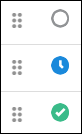
Click on the row status icon to mark an item as Completed. If the item is already set to Completed, it will be set to Not Started. This applies to all items, tasks and sections.
The status choices of Not Started, In Progress, Completed, Deferred, and Waiting on someone else, each map to a corresponding status icon. Clicking the status icon will cycle the status values between Completed and Not Started only. When updating the row, a busy spinner icon is shown.
Multi-Select
Delete
To delete multiple rows simultaneously:
- Select the rows to be deleted by using Ctrl-left click or Shift-left click.
- Hit the Delete key, or Right-click in the selected area and select Delete from the context menu.
- Select OK to confirm the delete action.
Grid Search
Search allows users to search the Grid and return items that meet the search criteria.
Any relevant task contained under a summary task will be visually organized in a hierarchical manner, with their parent summary task positioned directly above them. This hierarchy structure serves to provide users with a clear and organized view of the tasks within the summary, enhancing the overall user experience and making it easier to manage and understand complex task lists.
Note: The search format for dates is: YYYY-MM-DD (a preceding '0' is needed if entering a single digit). Valid examples: 2030-09-27, 2030-09.
For Yes/No Boolean, use search terms 'True' and 'False'.
Column Sorting and Filtering
To sort a column's values, click the column header and cycle through the sort options i.e., ascending, descending, and no sort. Alternatively, click on the filter icon at the top of the column and choose the desired sort option. Note that each level of the hierarchy is sorted separately starting with the top-level tasks in the hierarchy.
To filter values in a column, click the filter icon in the column header and select the desired value(s). There is a facility to search the column's values in the filter, which is useful for example with Lookup columns that have lots of values. To clear filter selections, click the filter icon in the column header and select 'Clear Filter'.
The results of filtering (or Search) display in a hierarchy even if the parent tasks in the hierarchy do not meet the filter or Search criteria.
Keyboard Navigation
| Interaction Keys | Description |
|---|---|
| F2 | Edits the selected cell |
| Enter | Saves the current cell and refreshes the Grid |
| Tab | Saves the current cell |
| Delete | Deletes the selected item |
| Esc | Deselects the currently selected cell |
| Ctrl + Shift + Up Arrow | Collapses selected item |
| Ctrl + Shift + Down Arrow | Expands selected item |
| Ctrl + Up Arrow | Collapses all items |
| Ctrl + Down Arrow | Expands all items |
| Ctrl + Home | Navigates to the first cell in the Grid |
| Ctrl + End | Navigates to the last cell in the Grid |
| Home | Moves focus to the first cell on the selected row |
| End | Moves focus to the last cell on the selected row |
| Up Arrow | Moves cell selection up |
| Down Arrow | Moves cell selection down |
| Right Arrow | Moves cell selection right |
| Left Arrow | Moves cell selection left |
| Alt + J | Sets the focus to the Grid |
| Alt + Down Arrow | Expands the list of choices when editing a Choice or Lookup cell |
Note: In order to save a new item, click within another cell in the Grid; clicking outside the Grid will not complete the save.
When adding an item in the bottom row of the Grid, you may need to use your keyboard down arrow to expose the name drop-down list in a Person or Group type column like Assigned To.
Configure the List Grid View Web Part
All web parts share basic modification functionality - click here to learn more. Modification options specific to the List Grid View web part are addressed below.
To configure the List Grid View web part: Click in an empty space on the Grid, click the Grid tab in the Ribbon, and then click Configure List Grid Settings.
Note: In addition to the web part configuration described in this section, standard configuration actions can also be taken on the underlying Project Tasks list.
In order for the Grid to function properly and to avoid errors, do not delete the Title or Status columns from the associated Tasks list.
Web Part Settings
Web Part Settings
Enter the web part Title and select the Chrome Type.
- Title
- Chrome Type
Select Source List
Select Source List
Select the list to use as a data source for the Grid. By default all items are returned from the list. To display a subset of the items select either a predefined view or specify a custom CAML filter.
- Select List
Select the source list, i.e., Project Tasks (list type 171)
-
Filter:
-
All items
This includes all items from the selected list. -
Items in this view
This uses the filtering from the selected view in the selected list. If there is no filtering specified in the selected view, then all items are included. -
Specify filter (CAML)
This allows you to write your own CAML filter and insert the code.
-
Select Columns
Columns
Optionally select the columns to display on the Grid.
You can view information and specify default behavior for columns in the Grid as follows:
-
Display
Select the checkbox beside the column name to display the column on the Grid. -
Column Name
This is the column name that is displayed to the user as configured in the settings of the associated list. You can also choose to use a custom caption, hide the caption, or adjust the column width. -
Type
This is the column type as configured in the settings of the associated list. -
Position from Left
The position from the left side of the Grid as presented to the user.
Tip! To use the Default Assigned To option you need to include the Assigned To column in the Grid.
Note:
- The List Grid View web part supports the following column types: Text (Single line of text), Choice (single choice only), Number, Currency, Date (Friendly format and Time are not supported), Yes/No, Person or Group (single selection only), Single-Value and Multi-Value Lookups, and Calculated columns.
- For Lookup columns, only Lookups that point at 'Single line of text' type columns are supported.
- If a Lookup column has additional fields selected in the List Settings, these values are not supported in the Grid.
- Calculated default values are not supported for any columns types.
- All 'Required' columns (except for 'Person or Group' and 'Lookup' type columns) must have a default value set for them; users can later edit these default values after creating a new task in the List Grid View web part.
- Percentage values will always be displayed without any decimal places.
Column Settings
Task Defaults
Default values for new tasks created in the Grid.
-
Assigned To: Defaults the Assigned To column to the Logged in User.
Note that the Assigned To column must be included in the Grid.
General Settings
Sections
Section behavior is turned on or off in Advanced Settings (BrightWork) in the Project Tasks list settings page. The setting is included in Grid Settings > General Settings for clarity.
Add Actions and Drag Fill Mode
Select 'Show Add and Drag Fill Mode actions in the grid' to show:
- Add-related actions such as Add Section and Add Task in the Grid. Unselect to remove the ability to add items from the toolbar actions, context menu, and through the keyboard.
- The Drag Fill Mode action in the toolbar.
If 'Show Add and Drag Fill Mode actions in the grid' is selected, then you can choose to select 'Optionally, show an Add action on the page if the grid is empty'. This will show the first step i.e., Add Section action, on the Grid if no items are displayed.
Delete Actions
Enable or disable deletion of items in the Grid. This will allow users with the correct permissions to delete items through the context menu or keyboard.
Calculate Schedule Action
When task scheduling is enabled for the Tasks list, you will have the option to display the Calculate Schedule action in the Grid. This will allow users with the correct permissions to run the calculate schedule for the list, which also refreshes any associated metrics.
Deployment Considerations & Troubleshooting
Co-existence
Having a Gantt Chart web part, or other List Grid View web parts on the same page as a List Grid View web part is not supported.
Other Web Parts
The List Grid View web part's design is focused on maximizing the space available on the page. This is to provide the best edit experience possible with the space available. Adding other web parts on the page "under" the List Grid View web part is not supported. You can expect any web parts added to the page under the List Grid View web part to be overlaid by the List Grid View web part.
Troubleshooting
Issue
When Filtering or Searching a Grid and adding a new Task, the new Task can appear under the wrong Task in the Grid.
Root Cause
This is due to a third party issue with a component. We are working with the vendor to get this addressed.
Resolution
Refresh the Grid and the new Task will appear in the correct location.