List Chart View Web Part
The List Chart View web part charts data from a single list on its parent site.
Click here to learn how to add a web part to a BrightWork web part page.
All web parts share basic modification functionality - click here to learn about this. Modification options specific to the List Chart View web part are addressed below.
Tip! If you need to refresh the List Chart View web part, you can do it by using the  Ribbon action.
The Report Information Icon
When you click the report information icon  in the title, a popup shows the details of the current report. It also expands the Ribbon, opening the tab associated with the web part.
Details include: the report title, the type of report, the data source the list uses, and what filters are applied.
Tip! Double clicking the report information icon will open only the Ribbon, dismissing the popup.
Configure the List Chart View
To configure the List Chart View web part:
- Click the menu
 on the chart.
 - Click Configure Chart.
Tip! Another way to configure the List Chart View is to click in the title of the List Chart View web part to expose the ribbon. Click the Chart tab and then click Configure List Chart Settings.
Chart Data Source
Select List
Select the list you want to chart.
Filter
There are three options:
-
All items in this list
This includes all list items from the selected list. -
All items in this view
This uses the filtering from the selected view in the selected list. If there is no filtering specified in the selected view all list items are included. -
Specify filter (CAML)
This allows you to write your own CAML filter and insert the code.
Web Part Settings
Title
Enter a title for the report.
Chrome
Select a chrome type for the report:
- Default
- Border Only
- None
- Title and Border
- Title Only
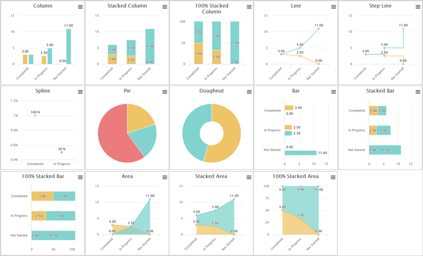
Chart Type
Select a chart type.
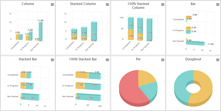
3-D Charts
The following charts can be rendered in 3-D.
Polar Charts
The following charts can be viewed in polar.
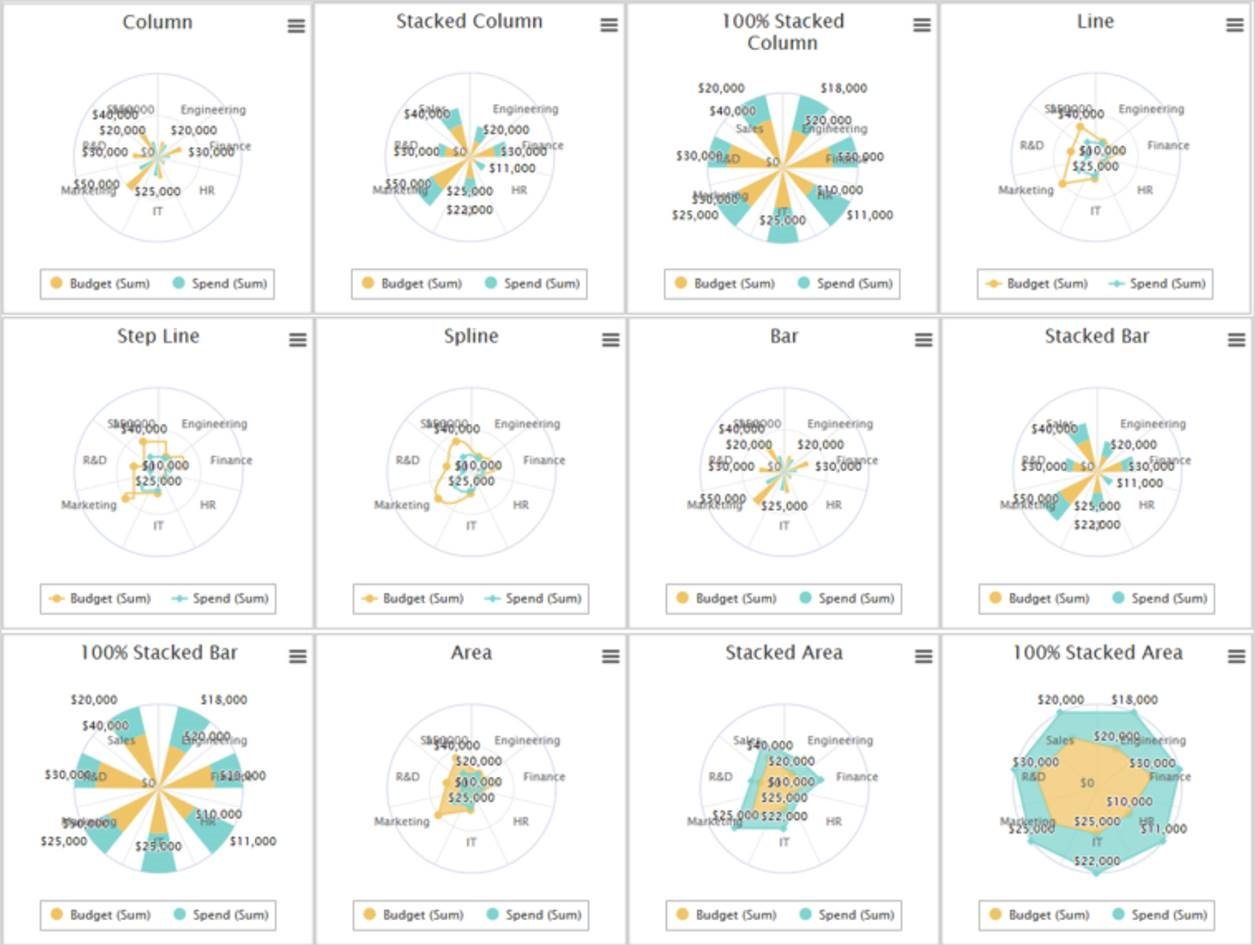
Note:The options to 'Pan' and 'Zoom' are not available on Polar charts.
Chart Data Binding
Select the columns to supply the data to render.
X-Axis Settings
-
Column
Select the column to use as the X-Axis -
Sort Direction
Select the direction in which you want the items returned to be sorted -
Enable categorization for this column
Select whether you want all the list items returned to be grouped according to the selected X-Axis column. Not selecting this checkbox means that list items returned will be individually displayed. -
Do not include data when the Y-column values(s) equal zero
Select to exclude items with a Y-column value of zero
Y-Axis Settings
-
Display the number of items in this group
Select to display the number of items in the X-Axis column -
Y Field
Select the column(s) to display along the Y-AxisOnly Number columns will be available for adding to the Y-Axis.
For most chart types you can select up to 10 Y-Axis columns. The exception are for Pie and Doughnut, for which you can only select one.
-
Grouping Formula
Select the grouping formula to be used on the selected Y-Axis column.
The available formulae include:Function Description Average
Calculates the average value for the column.
Maximum
Returns the highest value in the column.
Minimum
Returns the lowest value in the column.
Standard Deviation
Measures how widely values are dispersed from an average value (the mean).
Sum
Adds the items in the column.
Variance
Measures the statistical variance of all values in the column.
Note: Custom formatting of Dates, Number or Currency columns are not supported in charts.
Chart Appearance
-
Chart Theme
By default, charts use the local SharePoint theme to designate a color scheme for the Y-Axis columns; however, you can over-ride this and select a custom theme for the chart.Chart Theme
Y-Axis Settings
Col 1
Col 2
Col 3
Col 4
Col 5
Col 6
Col 7
Col 8
Col 9
Col 10
Default Blue Scale Bright 1 Bright 2 Excel Grey Scale Primary Traffic Light Spectrum Pastel Dynamic - If the chart type is Pie or Doughnut, the values in the selected X-Axis column will be illustrated.
-
Chart Width
Specify a width for the chart -
Chart Height
Specify a height for the chart -
Show chart border
Select this option to show the chart border. -
Chart Display
There are three options:- Show as standard
- Show as polar
- Show in 3D
-
X-Axis Options
Select this option to format for readability. When a chart has lots of data, the format for readability option enables clearer content as shown in the image below.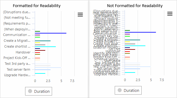
Note: Chart height and width settings of below 100px will be ignored.
This setting does not apply to charts using the BrightWork provider.
Tip! 'Show as standard' is the default option for displaying charts. A chart can be shown in either 3D and standard or polar and standard, but never 3D and polar.
Chart Title and Legend
Chart Title
-
Show Chart Title
Select to enable the display of a chart title -
Title
Enter a title for the chart -
Location
Select the preferred location for the chart title -
Alignment
Select the preferred alignment of the chart title
Chart Legend
-
Show Chart Legend
Select to display a legend that illustrates the selected Y-Axis columnsIf the chart type is Pie or Doughnut, the values in the selected X-Axis column will be illustrated.
-
Location
Select the preferred location for the chart legend -
Alignment
Select the preferred alignment of the chart legend
Chart Data Display Settings
Chart Data Labels:
-
Show data labels
Select to include in chart data results
Custom X Field Styles
You can match values in certain column types to a specific color, for example BrightWork includes a number of Red, Yellow, Green columns such as the Health Indictor. With this feature you can ensure that the colors displayed in a chart match these values.
To specify Custom X-Field styles:
-
Select Use Custom Styles.
This feature is only available when:
- The selected column type is one of the following: Text, Choice, User, Lookup, and Boolean.
- Categorization is enabled for the X-Axis.
- Only one Y-Axis is specified.
- Enter a value in the Values field and select a color.
- Repeat step 2 for the remaining values you want to match a color to.
The following rules specific to each column type apply:
-
Text values must be entered exactly as they are entered into list items.
-
Choice values must be entered exactly as entered in the choice column.
-
User values must use the user display name.
-
Lookup values must be entered exactly as entered in the originating column.
-
Boolean values must be entered as Yes or No.